This article, based on a presentation I delivered on UX design at a conference in Oslo last year, delves into how users navigate web pages, the reasons behind their behavior, and strategies to effectively capture their attention.

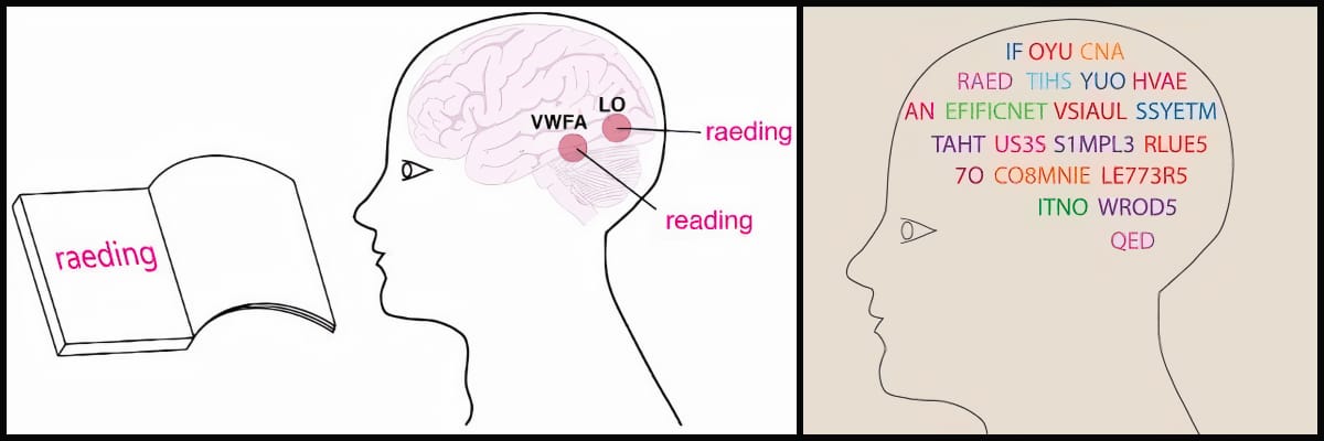
We scan words length and patterns, we don’t read letter by letter.
Users Don’t Read; They Scan: Why?
When examining online behavior, it’s essential to recognize a fundamental truth: users rarely read everything; they scan. Several factors contribute to this behavior:
Information Overload: Daily, users encounter vast amounts of data. To cope, they’ve developed the ability to quickly scan pages to extract essential information.
Time Constraints: In today’s fast-paced world, web visitors decide within seconds if a page is worth their time. If they don’t quickly find what they’re seeking, they move on.
Adaptive Behavior: Online, the brain operates differently than when reading printed text. It seeks visual cues like headings, keywords, and images, scanning rather than reading line by line.
How Does the Brain Read Online?
The human brain is remarkably adaptable, capable of recognizing words even when partially distorted, as demonstrated by the example: « N3v3r l0s3 h0p3 1n l1f3. » Online, this adaptability is further enhanced; we don’t read each letter but rather the overall shape of familiar words.
Consider advertisements on social media: they scroll by rapidly, yet our brains capture the gist without reading every word. Misusing this principle, such as overusing abbreviations or technical jargon, can hinder comprehension and increase bounce rates.
Different Web Page Scanning Patterns
User behavior online varies based on factors like task objectives, familiarity with the site, and page complexity. Key identified scanning patterns include:

1. The « F » Pattern
This is the most common pattern, identified through eye-tracking studies. Users start by reading the top lines, then move down vertically, making horizontal stops where headings or key points catch their attention.

For instance, a product page on an e-commerce site might feature a large product image at the top, a catchy title, followed by key information in bullet points, forming an « F » shape that facilitates quick scanning. Notably, Google’s search results often follow this « F » pattern.
2. The « Z » Pattern
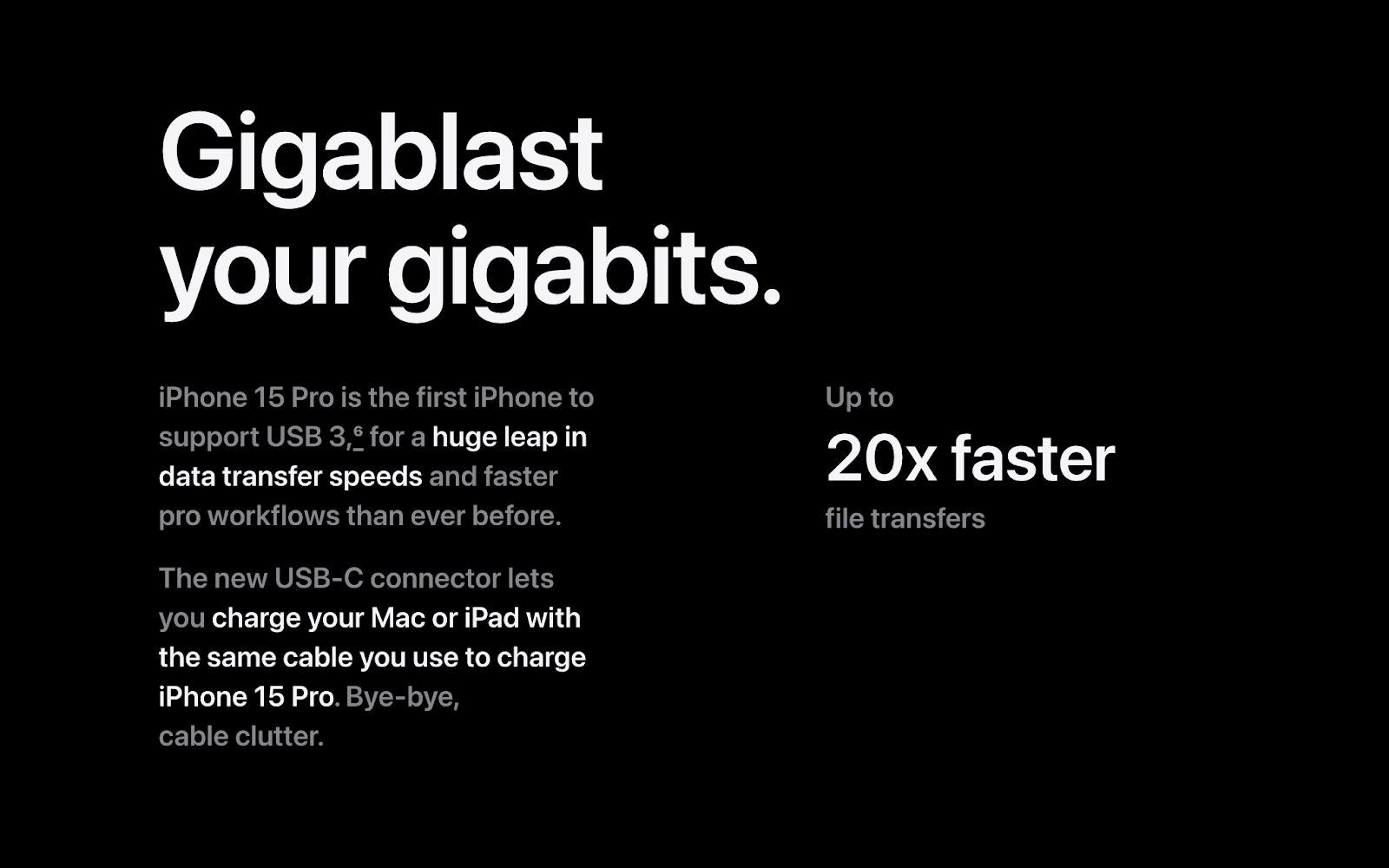
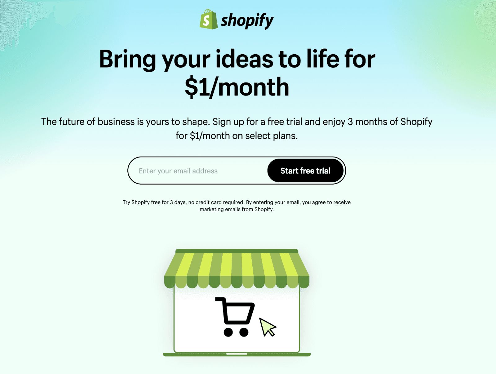
This pattern follows a « Z » shape, where users scan the top line, move diagonally to the opposite corner, and finish on a horizontal line at the bottom. It’s effective for simpler pages, like landing or home pages, with a clean design centered on a call to action in the bottom right.
An example is a homepage where users see a compelling headline at the top, a main image, and a prominent CTA at the bottom. Conversely, a cluttered page disrupts this natural flow.
3. The « Layer-Cake » Pattern
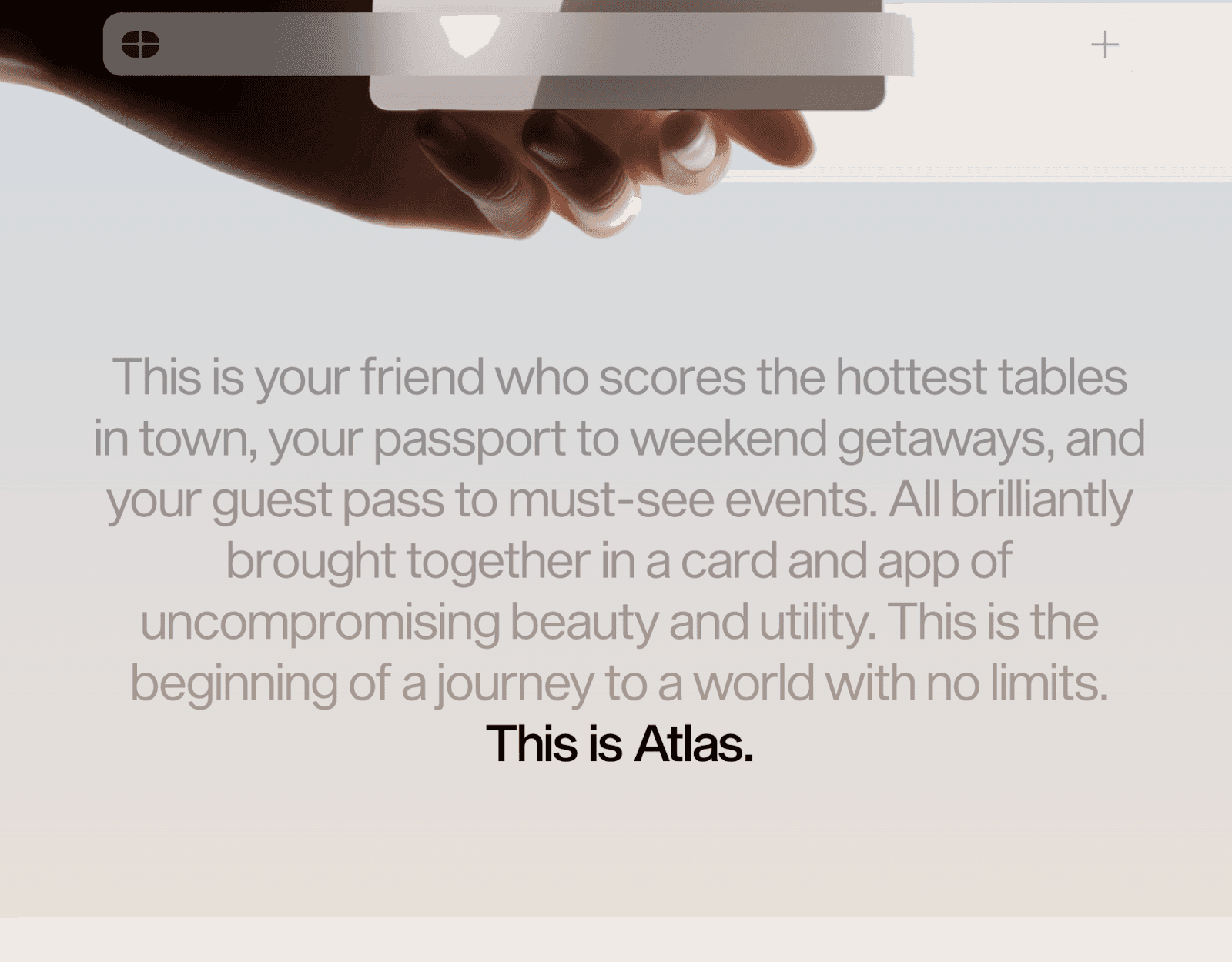
Here, clear and distinct headings and subheadings allow users to quickly scan and identify sections of interest. This is particularly effective for long articles or educational content.
For example, an article on « Adopting a Sustainable Lifestyle » might be divided into sections like « Reducing Waste, » « Promoting Eco-Friendly Transportation, » and « Choosing Renewable Energy, » each introduced by a visible heading for easy navigation.

4. The « Spotted » Pattern
Common on social media, users jump from one visual element to another, seeking points of interest such as images, keywords, or highlighted elements. This pattern suits platforms where user attention is particularly fleeting.
5. The « Marking » Pattern
Users identify a section they find relevant and focus solely on it, effectively « marking » it visually while ignoring the rest of the page. This often occurs in technical documents or product sheets where specific information is sought.
An ideal example is a well-structured product sheet with clearly outlined specifications. A poor example scatters important information, making it hard to quickly locate key data.
6. The « Bypassing » Pattern
In this pattern, users intentionally skip sections they deem irrelevant, jumping directly to content of interest. They might overlook text blocks, ads, or images, especially on cluttered or poorly organized pages.
These reading patterns aren’t exclusive to the web; they apply to various mediums presenting content, such as posters, signs, or comics.
Capturing Users’ Attention
To effectively engage visitors, employing certain strategies is essential:
Tell a Story
Content should be simple and well-structured. Visitors should immediately grasp the site’s value proposition. Each page needs a clear objective and an easily understandable message.

For instance, a startup offering financial tools might greet visitors with a clear message like « Manage your finances easily and securely, » increasing the likelihood of retention. Conversely, a site filled with technical jargon may deter users.
Clear Visual Layout
An intuitive design featuring prominent headings, short paragraphs, and relevant visuals is crucial. Images should draw attention without compromising message clarity.
A good example is magazine articles in publications like « National Geographic, » where attractive images, clear headings, and well-defined text blocks enhance readability. In contrast, sites overloaded with ads and flashing banners distract users and reduce focus.

3. Visible and Intuitive Calls to Action
Every website has a goal: to sell, generate sign-ups, or encourage sharing. To achieve this, calls to action—commonly referred to as « CTA »—must be highly visible and easy to understand.
A successful example would be a donation site for a charity where the « Donate » button is prominent and well-placed.
On the other hand, a site with poorly positioned or hard-to-find calls to action will miss the opportunity to convert visitors.

The way users interact with websites is rooted in human psychology and the need to quickly process vast amounts of information. By designing with these principles in mind, you can create a website that resonates with your audience and achieves meaningful results.
About me

Hey, I’m François Savard from END Agency
I design clear, functional products that cut friction and remove unnecessary decisions. END Space is my newsletter where I share ideas, trends, and what I’m working on.
🌉 Background: Creative Director in a digital marketing agency in Norway for 5 years, moved back to France to create END Agency.
🏄🏼♂️ Current focus: Build a community to connect designers and founders with END Space (the newsletter you just read).
🙈 Next goal: Organise future conferences about design, in France and abroad. Interested to join or co-host? Reach out to me.

